GRAPHIC vs. LOGO
What seems to be hurtful to business owners, project managers, and new self taught designers is that the the lack of identity for Branding and design.
Logo:
Your logo apart of your brand. Your Brand is a combination of a logo, colors palettes, fonts, voice, strategy and mission. Your brand is your companies identity. Your brand is created with a trained GRAPHIC DESIGN.
For examples: Those special things that creates you as you (culture, sex, racial and ethnicity) is essential in building who you are. The same is for your brand.
Your brand creates an outline for your company graphics.
A Graphic Designer will use skills gained/learn to build your logo. Your logo is a combination your primary colors, text, mark and/or style to create an identity for your company. Your logo will become an identity for your company. Link your companies finger print.
Example: Apple - the actual apple or Nike - the check mark
So what is a brand?
Your brand holds the following:
- Logo
- Typography
- Brand colors (3 primary/ 3 secondary)
- Tag line
- Mission/ Agreement
- Voice
Your brand and logo keeps your company versatile, as well as recognizable. By creating this guideline at the start of a business, it gives your brand time to mature, and be recognizable by potential investors, product distributors, and cliental.
What will building a brand will do:
- Effect/ Build you Audience
- Blueprint for your companies future
- Describe your company without words/ Self Marketing
- Makes your company self sufficient
Graphic:
Graphics has been lately replacing real branding or justified as logo. This could hinder the progression or future of a start up. Graphic design is essentially the creation of all those logos, images, websites, and colors that help your brand stand out.
Graphic:
1: of or relating to the pictorial arts also, relating to, or involving such reproductive methods as those of engraving, etching, lithography and photography
In other words graphics use too many colors to be considered a logo. Pictures, and photos have too many colors to be versatile When using too many colors - limit the versatility of your logo.
Let me show you the difference:
Using Pepsi, due to the company history and brand recognization.
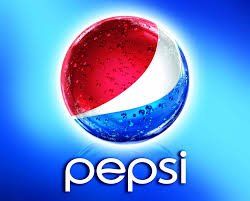
This is a Graphic: (using branding)
The highlights on the logo mark and font creates more colors that's represented, as well as the water drips. This would not transfer to a t-shirt or product. However this graphic looks great on digital devices and print campaigns.
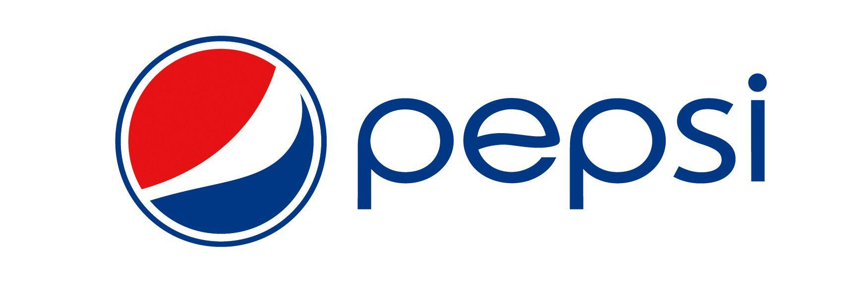
This is a logo: (a part of your branding)
This logo uses the brand primary colors, and can be easily represented on different platforms including apparel.